 I would like to draw attention to a detail on a medallion deigned by Sergey Chekhonin (Tchehonine), from 1918.* On Chekhonin’s work of art an able-bodied female and a ditto male are depicted. The female stands before a cropland. She is carrying a sickle and a spade and so represents farmers. The male stands before a factory. He is holding a sledgehammer in his right hand, thereby seems to represent (despite Chekhonin’s choice of a non-factory tool as symbol) industrial workers. Behind him, on the ground, rests a parcel, perhaps with goods from his workplace. In his left hand – and it is this detail I found surprising – he carries a caduceus.
 From the late 19th and early 20th century, we spot the caduceus – or Mercury himself, or symbols associated with him (especially his winged helmet) – on trade union banners and emblems. In Sweden and Denmark – and certainly in the countries that harboured workers’ movements that influenced the culture of these small countries, Germany and Britain above all – the banners and emblems decorated with this symbolism belong to unions that organized personnel working in shops, offices and akin workplaces.** This is hardly surprising since Mercury (Hermes) famously is, among other things, the god of commerce.
Is it possible that Chekhonin, fashioning this medallion, choose to use two symbols for farming, one for industrial production and one for commerce? Considering the emphasis of the Marxist Bolsheviks on the historical role of the industrial proletariat, this interpretation doesn’t strike me as entirely convincing. But I am not able to come up with a better one.
* Medallion from Richard Stites, Revolutionary dreams: utopian vision and experimental life in the Russian Revolution, Oxford University Press, New York, 1989.
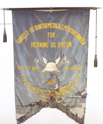
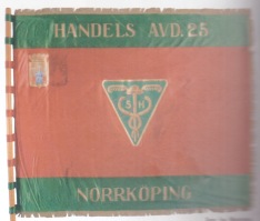
** Banners from trade unions for personnel working with commerce (and in offices). From the Danish city of Herning “with surroundings” (reproduced in Henning Grelle, Under de røde faner: en historie om arbejderbevægelsen, Fremad, København, 1984) and the Swedish city of Norrköping (reproduced in Margareta Ståhl, Vår enighets fana: ett sekel fackliga fanor, LO, Stockholm, 1998).
 Created by Ivan Simakov (1877-1925), the Soviet poster from May Day 1921 is like a synthesis of Crane’s picture and the cover to Mother Earth.* The colours in Simakov’s image are bright and clear and dominated by red and green. The world tree has been cleaved into two; the one and only magnificent tree, an ash-tree perhaps, has been substituted by two common birches. Between these birches stand a male and a female peasant. In front of the sun they raise the hammer and the sickle. The sun is not rising; it is already high in the sky. The tree supports stabilize and signify order, but it is the sun – and industrial and agrarian labour – that is the guarantee for prosperity and happiness. The place for the incarnation of the non-place (u-topia) is apparently on Soviet soil.
 Despite the fact that Walter Crane now and then played with baccantic motives and portrayed ludic games out in the wild, the more carnal aspects of the
  courtyards – has in the poster been substituted for a
 I’m uncertain whether the interest in
 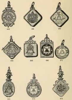 This blog post is decorated with medallions/charms from the Knights of Labor as displayed in F. Irons & Charles A. Russell, Illustrated Catalogue of Solid Gold. Society Emblems, Pins, Buttons and Charms, Providence, Irons & Russell (1895) and a marvellous pin from
 Thanks to
 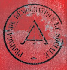 Dr. Leipold concluded his mail to me pointing out that: “Since, Harney and the Fraternal Democrats were quite close to their French counterparts, it seems like the symbol might have been a frequent component of social-republican/socialist iconography at the time.“ I can not but agree.
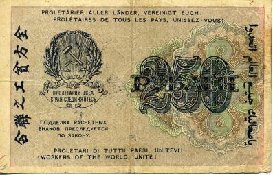 The very first notes ever to be printed and circulated in a socialist realm is probably
  By spring 1936, the French literati George Bataille famously came to the conclusion that Fascism had to be fought with its own means. For a surrealist inclined intellectual, this meant not jibbing at the darker sides of human existence: desire, perversion, violence, torture, sacrifice, fanaticism and death. For this aspiration, Bataille has been, quite erroneously according to my view, branded “Left fascist” by Richard Wolin.*
 I wonder whether there are connections between this aspiration of Bataille and his friends and fascist-like feature in anarchism? I’m especially thinking about the obscure anarchist
  Already in the Russian Civil War,
  * I find the Wikipedia article on
  I was surprised to find the topic “Soviet Swastika” being discussed on different pages on the Internet.
  The explanation is not shared fondness for totalitarianism, but the fact that the insignia was designed for Kalmyks fighting in the Red army. The Kalmyks are Buddhists and the swastika a well-known emblem for that creed. Thus, the explanation is some kind of Bolshevik tolerance, rather than totalitarianism.
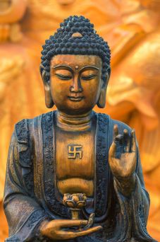
 Remembering how left-wing friends in the 1980s took great interest in the Sandinista revolution in Nicaragua (recall The Clash’s album Sandinista! I personally backed the Contras, perhaps not my finest political decision), it is intriguing to learn from Donald C. Hodges’ Sandino’s Communism: Spiritual Politics For The Twenty-First Century (1992) how deeply involved
  Sandino seems to have taken a particularly keen interest in the religio-philosophical ideas of Escuela Magnético-Espiritual de la Comuna Universal, founded by Joaquín Trincado Mateo. The Magnetical-Spiritual School of Universal Commune, “the direct continuation” of the magical system “Moses founded 36 centuries ago”, if we are to believe
 I’m reading the final draft for
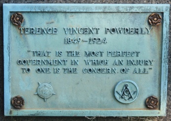


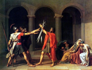 In modern times the so-called Roman salute was immortalized by Jacques-Louis David in his T
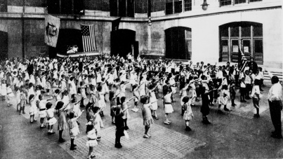
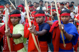
 Female socialists take part in fighting for the cause, but their bodies is moreover regularly used as propagandistic icons. In contrast to the iconic liberal painting La Liberté guidant le peuple by Eugène Delacroix, the female socialists not only instigate and lead but take active part in the violent struggle. The essential message of these photos is thus the emancipation of women from enclosed homes, restrictive garments and patriarchal codes of conduct by martial empowerment.
 * Photos of
  Having Google-translated three Russian texts that Roland Boer (
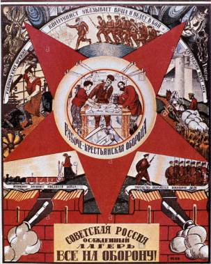
 The red star of communism is one of the most familiar signs in modern politics. Still, there seems to be surprisingly little known about its origin. Like everything else that we encounter repeatedly, and has been present already from our childhood, the red star of communism appears palpable. But on reflection, this choice of symbol is of course far from evident: why on earth do a star painted red symbolise the movement that aim to abolish class societies?! During the last year, I have taken every opportunity to ask historians, even specialists in the history of socialism, if they knew the answer to this enigma, but they have left me empty-handed.
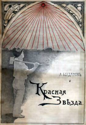 In 1908, Alexander Bogdanov published
  (Nota bene, that the red star on this newyear postcard is, for some reason, a pentagon.)
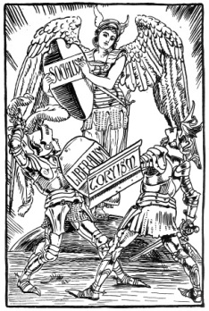 From mid 19th century, liberals and socialists occasionally draped their ideals in the clothing of the Viking. Richard Wagner and William Morris are probably the most influential radicals celebrating the simple and solid way of the Northmen, Icelandic anti-monarchism and Scandinavian beauty. In 1896, artist Walter Crane depicts the Valkyrie of Socialism as Nike defeating Liberalism and Toryism.*
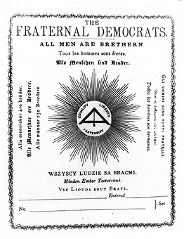

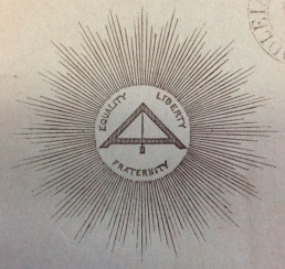 From the frontcover to The Democratic Review of British and Foreign Politics, History and Literature (1850). Harney, G. Julian (ed.). Vol. II. London: J. Watson.
 Conspiracy theories about occult origins of socialism circulate on the Internet. Socialists who have been initiated into freemasonry or accidental similarities between socialist and esoteric iconography are taken as proof of an occult, virtually satanic, genesis of the worker’s movement. Not everything in these far-fetched theories is false however, as the existence of The Noble and Holy Order of the
  halfway between a pair of compasses and an A – “A” for Asociation/Association, I take it. It’s like the pair of compasses (and maybe the square/ruler) builds the letter. (There is probably also a plumb bob.)
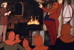 Inspired by the masons, the above-mentioned Knights of Labor used an emblem called Great Seal of Knighthood, depicting simply an encircled triangle. (Here represented in the animated Sherlock Holmes and the Valley of Fear from 1984 as the ominous emblem of The Eminent Order of Freemen.) The triangle is a good start on the way to the letter A as in the anarchist A… After the collapse of the Knights of Labor, the anarcho-syndicalist
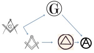
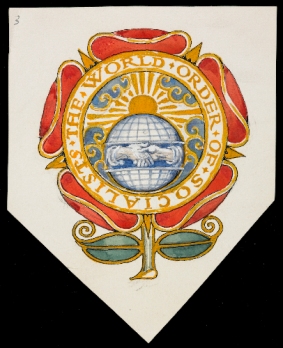 Socialist heraldic designs, the earliest examples going back to late 19th century organizations and fraternities, display a fascinating mixture of observance to established rules of heraldry and consciously rebellion against these rules. Beside is an emblem painted by Walter Crane for “The World Order of Socialists”, a fraternity/trade union I believe only existed in his mind.* The heraldic shield is substituted for the rose, which at the same time functions as a kind of mantling. The handshake, typical for trade union iconography, stretches over the entire globe, divided in rational quadrangles. The sun is rising.
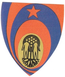 Finally, most experimental and rebellious, is the coat of arms for a Hungarian city, designed in the 1970s.*** Op art goes commie.
 The Holy and Nobel Order of the